
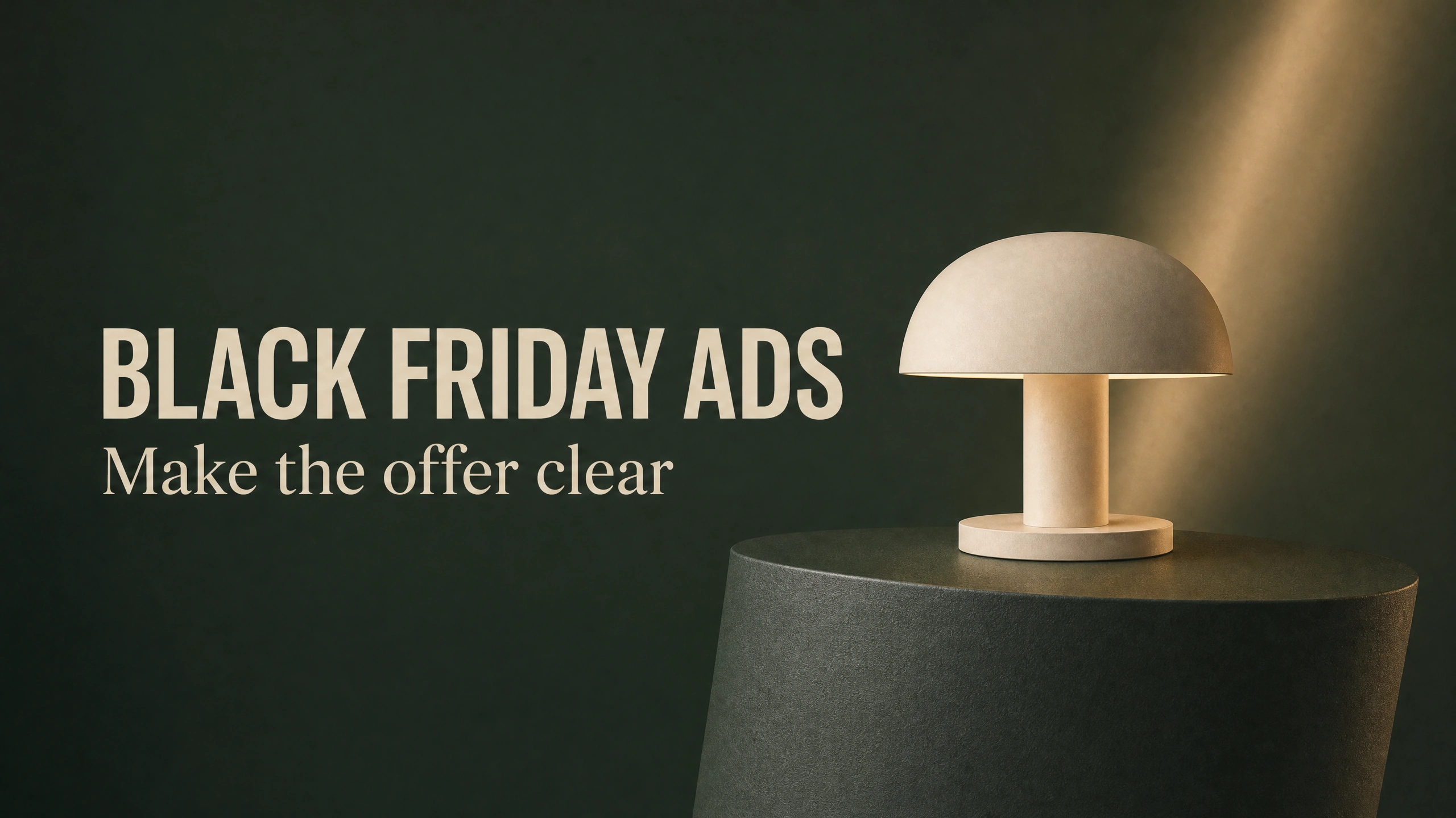
Remember that the small job of the Black Friday ad is to tell people what you are selling, what offer there is and when it will end. Only afterwards can you start to add atmosphere to your ad.
This was a simple job to explain, the lamp was a fictional product a cream mushroom-shaped table lamp, falling from $48 to $36. A 25% offer would run on this product from 27th November 2026 until 30th November 2026. Above the image of the lamp the largest line of text would read “25% OFF”. Beneath this the old and new prices would run side by side, and beneath that the dates for which the offer is available.
Black Friday falls on 27 November in 2026. So October is a good time to negotiate the offer, gather approved images of products that will be offered and develop the creative work needed to advertise them. By then there is still time to change dates in the completed layout before the ad appears.
Work out the offer before you start to work on the images.
Make a simple statement that describes the offer. For example: “This lamp is reduced from $48 to $36 from 27 to 30 November 2026.” If the shop owner cannot approve this simple statement then the brief has not been approved.
For a real business set out the approved product or variant(s), store code, offer dates & time including time zone and any conditions of offer that must be communicated to the customer. Do not use the prices or discount shown in the example above. These have been invented for demonstration purposes only.
This results in a saving of $12. Dividing the saving by the original retail price of $48 results in 25% which we have used in the headline above. This calculation must be included in the brief so that later edits cannot alter the headline to read ‘30% OFF’ and still list the retail price at $48.
However, note that ‘up to’ offers and ‘selected items’ are to be viewed with particular suspicion as they can so easily be represented in a way that portrays a greater offer than is actually the case. For example, in US advertising, the FTC’s advertising guidance requires that all claims be truthful and non- deceptive with supporting evidence to back up said claims. Therefore, a lovely image does not make a false offer true. Also, the ‘prior price’ must be true and must be a genuine price regularly offered for a reasonably substantial period as opposed to a high price which has been inflated to show the ‘offer’. Check the prior-price rules for the relevant market in which you are advertising.
The approved sentence for the offer should be stored in the same place as the image, i.e. for reference in case of further edits (e.g. for other crops, colors etc.).
Give the product somewhere to sit
This example image was created using PromptWise and GPT Image 2.0 within the work of the AI Video Bootcamp. PromptWise is affiliated with AI Video Bootcamp. The dark green background of the image, and the matching color of the pedestal upon which the lamp sits, are part of the makeup of the offer image. The large empty space above the product is there to create space for the headline above the lamp.
For real items, start with approved images of the products. The output should look similar to reference images provided by you. Pay close attention to shapes and details of parts such as the shade, stem, base and surface finish of products. A stylish alternative image must still show the product the customer expects to receive.
This lamp changed slightly between the ‘clean’ image shown here and the ‘ad’ image. In particular, its overall proportions have not been set in stone and so will change slightly from image to image. This is all fine for demonstration purposes with a completely fictional product but it does highlight the importance of checking a real product very carefully for generation.
Here is a starting prompt you can adapt:
“A cream mushroom-shaped table lamp on a dark forest-green pedestal. Warm light under the shade, soft studio lighting, an uncluttered background and a straight-on view. Place the lamp in the lower half of a portrait composition. Leave a generous quiet area above it for a sale headline. No lettering.”

The artwork-only reference leaves room for the offer. This lamp is a fictional product.
In this simple example, the relation between the object and the empty area above it is what’s most important for the image. That means that instead of having to change images of candles, of bottles etc. for a later version of the same ad, you can change the object of this simple image for a new single image. As long as the object fills the frame of the image, there’s no comfortable place to add the rest of the copy for the offer above the object.
AI image generation is covered in AI Video Bootcamp’s guide to learning AI image generation. So, for now, just learn to create one suitable composition for this ad and then we can make a full campaign out of it.
Decide what gets read first
In the example completed, the largest line of text is “25% OFF”. The image of the lamp object is used to identify the subject of the ad, and the offer information, “WAS $48 • NOW $36”, explains the monetary savings to the buyer. Finally, the dates for when the offer is valid are listed below the image of the lamp.
As previously mentioned, you could also make the name of the product the biggest element, but in this case the short offer for the familiar lamp allows the percentage discount to lead.
To avoid overloading the image with additional offers, slogan and other visual marks in case there is room enough to place them, the dark green background should be kept as it is and serves to keep the cream of the mushroom-shaped lamp shade and the copy separate.
Adobe’s layout best practice is to group related information together. This ad uses this guideline by positioning the old and new prices together allowing the viewer to easily read the information as opposed to having to search for the information in the corner of the image.
You generated the finished ad (with all copy included) from the clean lamp image (reference image). Check every number and every date as if you or someone else had typed them. (AI may change letters in an attempt to better words. If that keeps happening, keep the useful image and create editable type to place over the image in your design editor.)
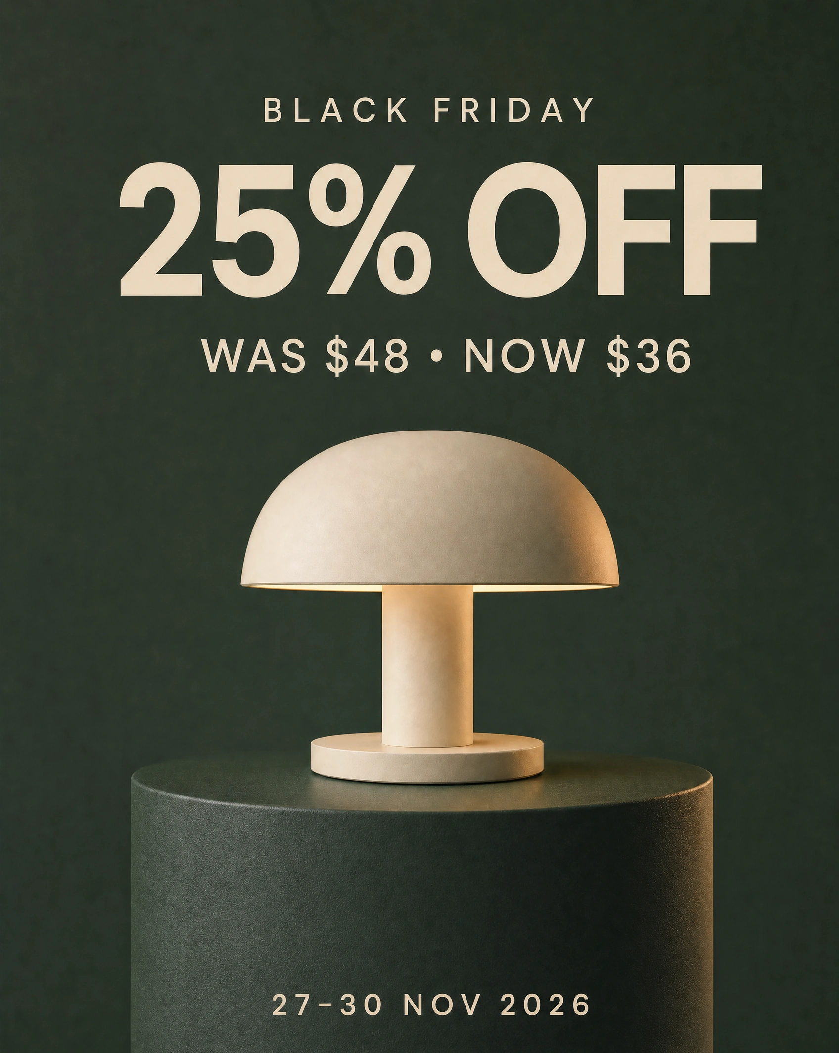
The completed demonstration ad. The discount, prices and dates are fictional practice copy; the lamp proportions changed slightly from the reference.
Look at the small version, not only the impressive one
For checking reading in small spaces, reduce the image size to about 320 pixels wide (as used for this visual inspection). The big discount and prices will read OK but the smaller dates should be checked to make sure they don’t turn into a row of decorative dots should they need to be increased in size.
Ask someone else to read the offer from your creation as you view it in a small version. A 320 pixel wide image was used for this visual inspection, and as you can see, the large discount and the prices are readable, while the dates are a little smaller and you have to read them carefully. If the dates turn into a row of dots when you view them in a small version, give them more space or make the lettering larger.
Also check the crop for the final placement. A portrait designed to fit on one screen may have its date line cut off on another. Make a separate composition for any required placements, and make sure essential information is not near an edge of the composition.
For web text and images of text it is useful to check the contrast using the WCAG guidelines for contrast (4.5:1 or 3:1 for large text, with specified exceptions). Just because something looks good on a dark background, does not mean that the contrast for all the characters in the image is sufficient. Also, passing one contrast test does not mean that the whole ad is accessible. Make sure the offer is also available in readable page or post text.
If the object looks convincingly lit but looks strangely shaped, then go back to the reference image and check the likeness of the object again. The photorealistic AI prompts guide will help you create such images, but it will not help you with checking the object’s likeness.
Make the handoff match the ad
Before you send off the creative for use, ensure that the ad matches the ad’s landing page / checkout information, i.e. that the product being promoted, the qualifying offer, code requirements and dates all are accurate on the page.
When handing off creative assets for use in your ads, be sure to supply your designer with a clean version of the product being advertised, to be used as the primary product image in Google Merchant Center for example. Note that this would exclude the sale copy, etc. from the image and that Google also requires AI-origin metadata to be left intact when edited.
Big numbers for Black Friday/Cyber Monday need context. As was reported earlier, Shopify saw $14.6 billion in gross merchandise volume from its merchants over Black Friday–Cyber Monday 2025. That was for 2025, and a total for all of Shopify’s merchants, not their profits, nor a forecast for 2026.
For a small business, it’s useful to think of a lot more than this when you’re discussing advertising ‘on line’. Use the approved offer, recognizable product, readable creative and the right destination for your ad before spending money on distribution.
However, after you approve the still image, you can explore animation of the same offer – with one simple movement. And, again, AI video prompting is very easy to describe even one simple movement. No need to animate all the copy of the sale offer.
For your first image, choose a product and an offer to work with and keep it simple by being able to clearly describe the image in one sentence. Go and fix the offer for the store’s current offer rather than trying to make the image more dramatic to get around this.
Sources and visual credits
Shopify — Black Friday planning and 2026 date
Shopify — 2025 Black Friday–Cyber Monday merchant GMV
FTC — Advertising and Marketing Basics
eCFR — Former price comparisons, 16 CFR 233.1
Google Merchant Center — Image requirements
All illustrations were generated for this article through PromptWise using GPT Image 2.0. No sales-performance test is represented. Prices and product are fictional.