
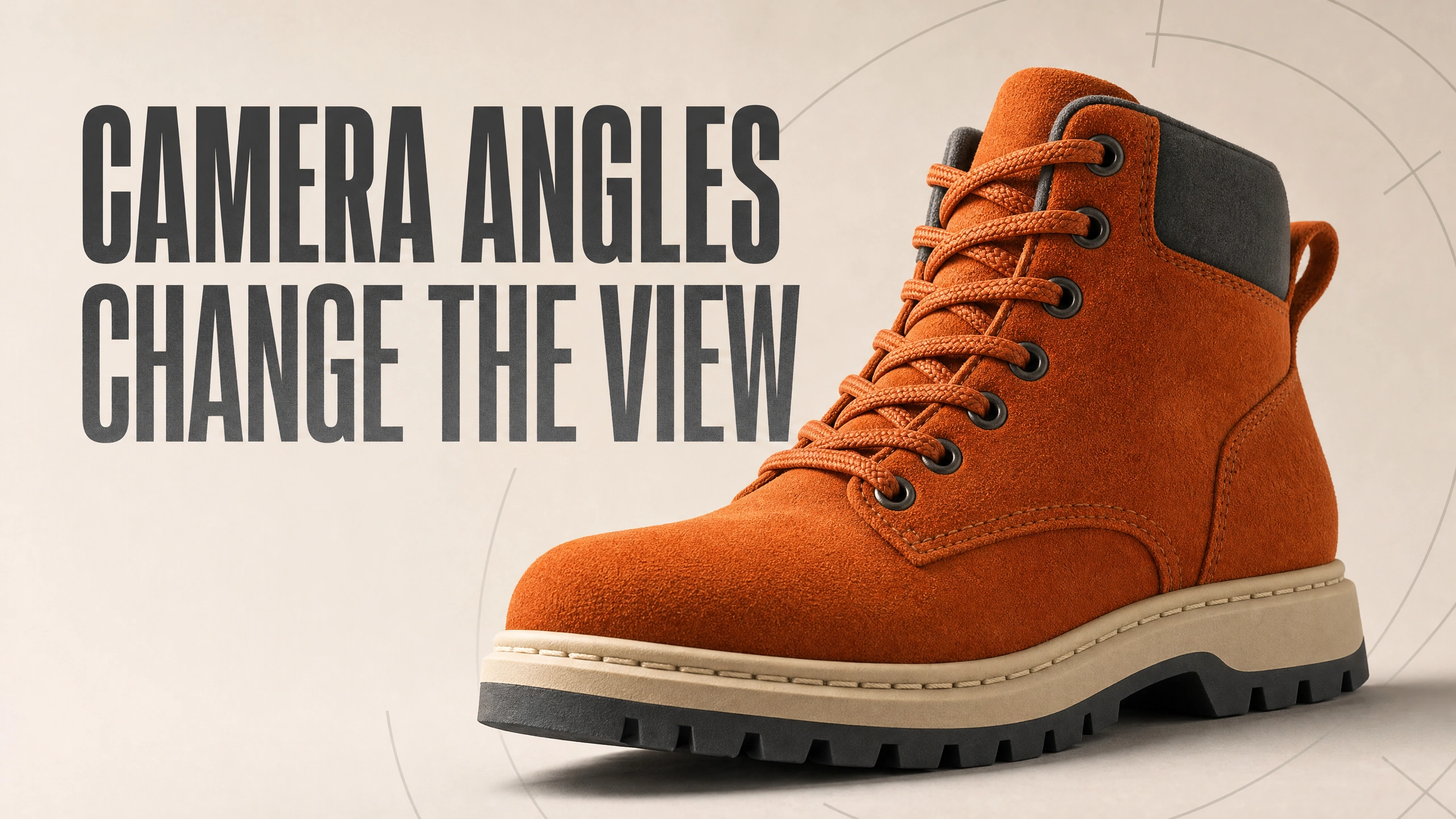
Before adding another dramatic adjective to an AI image prompt, try moving the camera.
A low view of a hiking boot can make its toe and sole feel substantial. A higher view can show the opening, tongue and laces more clearly. A level view may give you a straightforward silhouette. You have changed what the viewer can inspect, even before changing the light, background or copy.
That is the useful starting point for camera angles: decide what someone needs to notice, then choose a position that shows it.
The example here uses a fictional orange hiking boot generated on October 21, 2026 in PromptWise, with its GPT Image 2.0 option. PromptWise is affiliated with AI Video Bootcamp. One reference image led to a three-panel comparison: eye level, low angle and high angle. It is a concept exercise, not a photograph of a real product. Some construction details drift between the panels, which makes the comparison useful for learning and unsuitable as proof of exact product consistency.
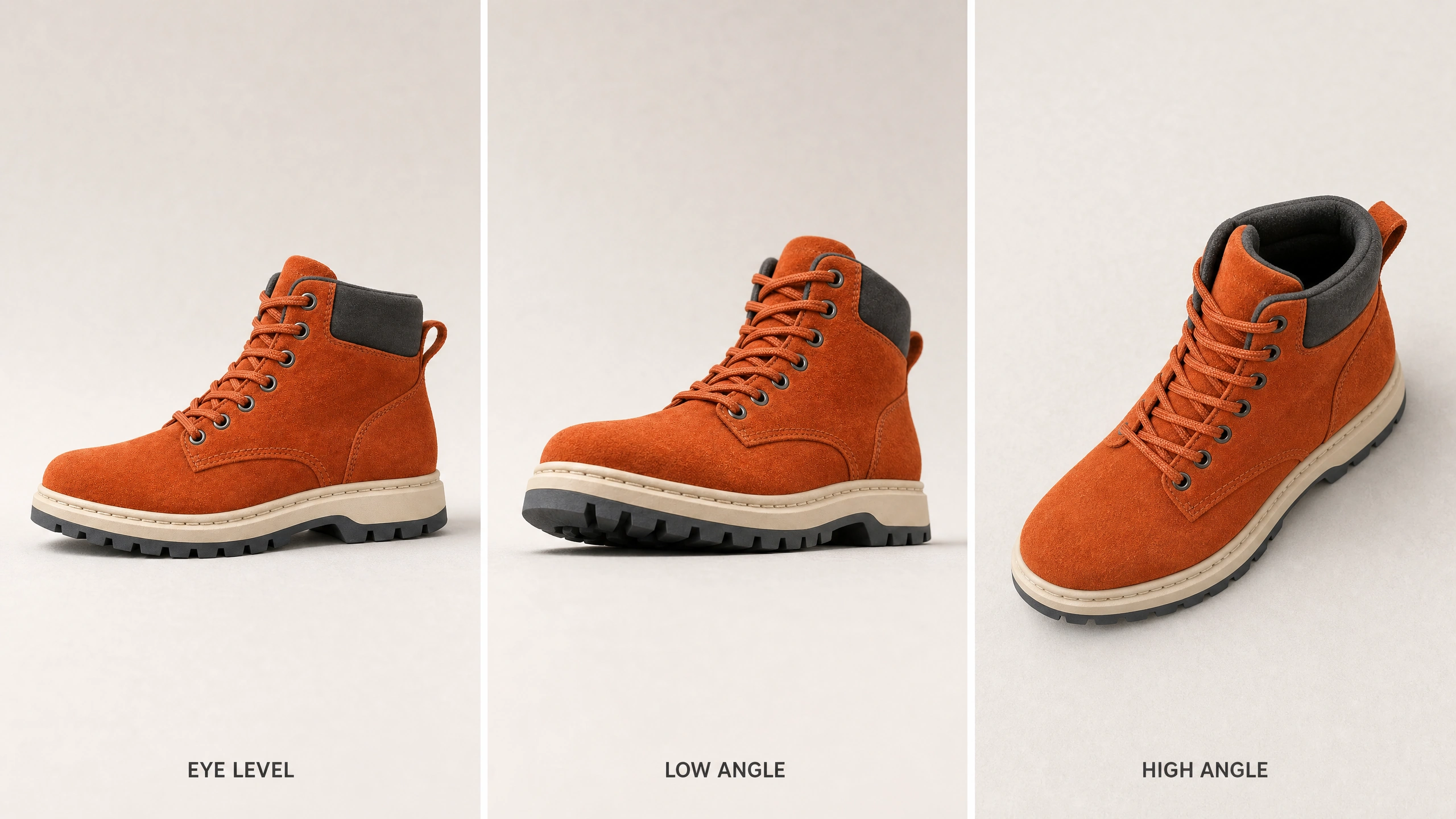
One generated comparison using a shared reference. The high view also changes rotation; seams and proportions drift, so this is not a controlled angle-only test.
Ask what the picture needs to explain
Imagine you need three images for a product launch. One introduces the overall design. Another gives the product a stronger presence. A third helps someone inspect the opening and construction.
You could ask for three different styles. I’d first try three useful viewpoints with the same visual treatment. That makes it easier to see whether the camera position is doing a worthwhile job.
In the boot example, the level view makes the side silhouette easy to read. The modestly lower view brings the toe and dark tread forward. The high view shows much more of the opening and the path of the laces.
Those are observations about this example. They are not rules that a low angle always makes a product powerful or a high angle always makes it weak. The subject, crop, light and surrounding scene also matter. A high view of a beautifully arranged meal can feel generous and inviting. It need not make the meal seem vulnerable.
When choosing an angle, use a sentence you can check: “I want the customer to see the opening clearly.” That gives you a better decision than “I want it to feel more premium.”
Keep angle, size and rotation separate
Camera angle describes where the camera looks from relative to the subject. Shot size describes how much of the subject and scene appears in the frame. Rotation changes which side of the product faces you.
A close-up is not automatically a low angle. An overhead shot is a particular view from above; a camera looking diagonally down is also a high angle, without being directly overhead. A larger boot in the frame may simply be more tightly cropped.
This matters in AI generation because a short instruction can trigger several changes at once. “Make it dramatic” may lower the viewpoint, enlarge the product, darken the scene and add a new background. You might like the result and still have no idea which change helped.
Photographer Todd Vorenkamp describes the effect of changing viewpoint in his March 30, 2016 B&H article on viewpoint and perspective: “The background and foreground change with it.” The camera instruction is a relationship between things in a scene, not a decorative label pasted onto an otherwise identical picture.
For a simple comparison, specify the view you want and the things you want to hold steady. Then inspect whether the model actually followed both parts.
Build a reference worth keeping
Start with a clean product reference. For real client work, use authorized images of the real item, including the surfaces the new viewpoint will reveal. A single front view cannot show a generator every hidden seam or fastening.
The fictional boot reference has orange suede, a dark padded collar, orange laces, a cream midsole and a black outsole. It sits on a quiet warm-gray studio floor with soft light from the left. There are no props competing for attention.
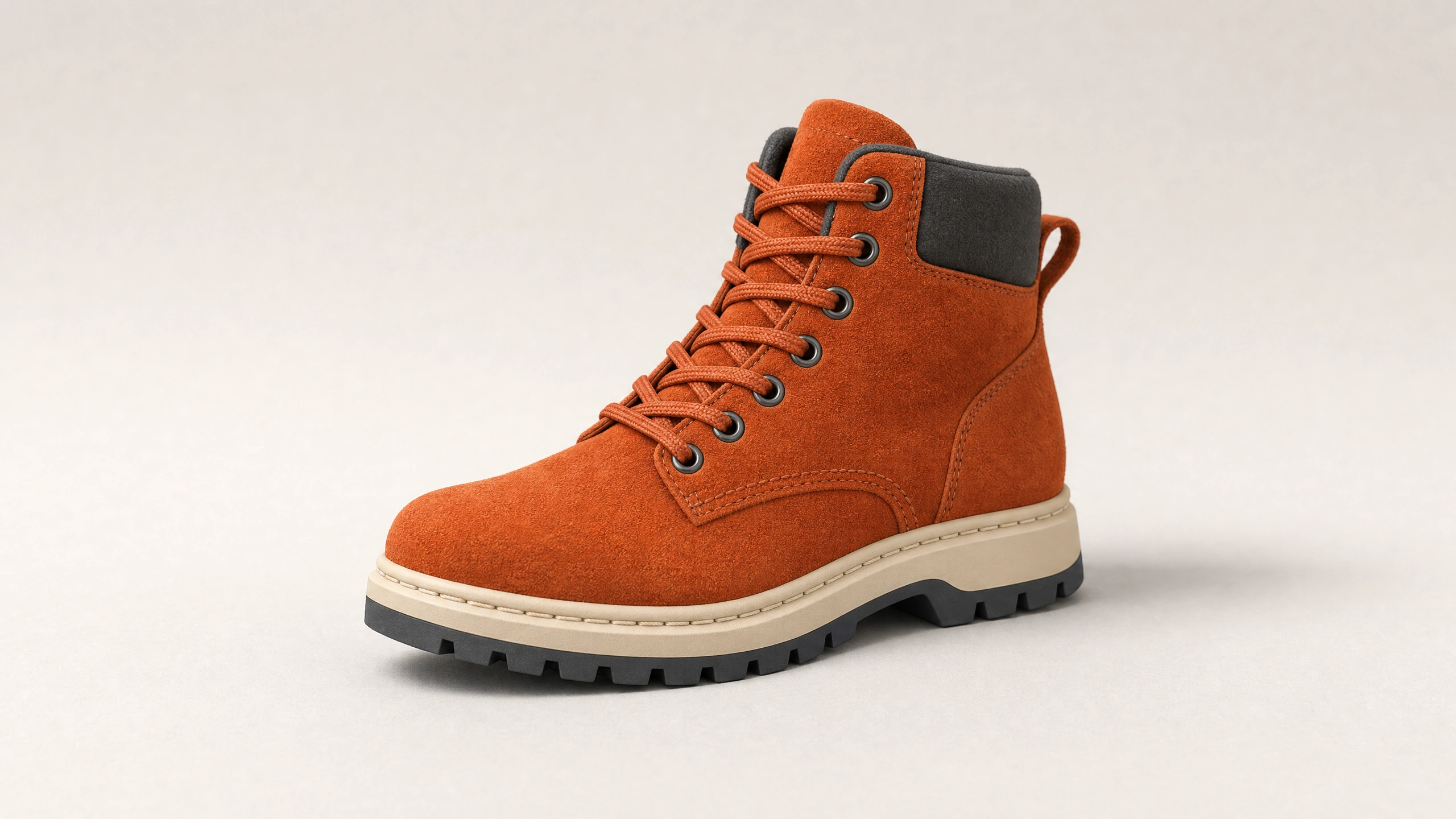
The accepted generated reference. Use authorized photographs of the actual product for client work.
The reference does not need to be the final advertisement. It needs to make the identity readable. Check the shape, materials, color boundaries and details before building a family of images from it.
If a generated reference contains a broken lace or an impossible sole, fix that first. Otherwise you may spend the next few requests asking the system to preserve a mistake.
In PromptWise, the accepted reference was used for the comparison generation. The resulting images share a recognizable overall design, but the reference did not lock every detail. That distinction should stay in your own review, especially when the item represents something a customer can buy.
Give each viewpoint a specific job
For the level view, ask for a camera near the middle of the product, looking across rather than strongly up or down. With an object that has no eyes, “eye level” is a convenient label for a level product view, not a literal anatomical position.
In this comparison, that view gives a readable side shape and a clear separation between the orange upper, cream midsole and dark tread. I’d use it when the overall design matters more than an exaggerated sense of scale.
For the low view, put the camera near the floor and ask it to look upward. Keep the whole product in view if the purpose is to compare silhouettes. The generated low panel is a modest lower three-quarter view rather than an extreme floor-level shot. Its toe and front tread become more prominent.
Check what that emphasis hides. A powerful-looking toe is not much help if the customer needs to understand the opening. If the sole looks absurdly thick or the boot seems to float, the dramatic effect has outrun the useful information.
For the high view, ask for a camera above the product, looking diagonally down. In the generated example, this reveals the dark opening and the tongue. It also rotates the visible presentation toward the front. That extra change is why this is a practical comparison rather than a controlled angle-only test.
I would choose that view when the top surfaces answer a question. I would not choose it simply because it looks different from the first image.
Use a prompt that leaves room for comparison
The core instruction for this exercise can be reused with another product:
“Use the attached product as the identity reference. Show three views on the same plain studio floor: a level view, a low view looking upward from near the floor, and a high view looking diagonally down. Keep the color, materials, parts and lighting consistent. Keep the entire product visible in each view. Do not add props or redesign the product.”
The boot example added the specific materials and requested readable labels under the panels. The three labels are correct in the output. They make the comparison easier to discuss, but labels are not evidence that the viewpoint itself is right. Look at the visible surfaces.
If you need separate images for a real campaign, generate or edit each view from the same approved references. Keep a short record of what you asked to change. Do not quietly turn the new low-angle image into the reference for every later view unless you have checked its details against the original product.
Google’s November 20, 2025 prompting guide recommends being explicit about composition, lighting and the role of reference images. Those are useful planning habits across tools, although they do not guarantee the same result from different models.
Inspect the boring details before choosing the exciting image
Put the reference next to each result. Compare the toe outline, seam path, eyelets, lace arrangement, collar and sole. Move through the same list each time.
The boot triptych passes the broad design check: orange upper, dark collar, orange laces and a two-tone sole remain recognizable. It does not pass a strict manufacturing-detail check. Some seam paths, toe details and sole proportions change. The high-angle panel also changes the horizontal view.
That is a useful warning for commercial work. A coherent family resemblance is not the same as an accurate product depiction. If the view will be used to sell a real boot, compare it with real photographs of that side and have the relevant person approve it.
Then inspect the light. Are the highlights and shadows compatible with the same source? Does one panel suddenly have a hard spotlight while the others use a soft window? Is the color changing because of lighting, or has the material itself changed?
Finally, check the framing at its intended size. A tiny comparison panel can make subtle differences disappear. Keep the main teaching points visible without requiring someone to enlarge the image and hunt for them.
AI Video Bootcamp’s photorealistic prompting guide is a useful companion for material and light descriptions. The AI image generation learning guide covers the broader process. Use those to improve the reference before adding more camera instructions.
Turn the choice into a shot plan
You can use this comparison to plan a video without claiming that three stills prove a continuous camera move.
For example, the level image could introduce the boot, the low view could emphasize the tread, and the high view could show the opening. Each shot would have a different informational job. You would still need to generate and inspect the motion, continuity and transitions separately.
Be particularly careful with an orbit around a product. It asks the model to invent surfaces between viewpoints. If the still-image exercise already changes construction details, a moving shot deserves closer inspection, not less.
The AI Video Bootcamp guide to writing AI video prompts can help turn an approved still into a focused motion brief. Start with the intended action and stable details. Do not add a camera move merely to make the shot busier.
Your next exercise can stay small: choose one object, make a level view, a low view and a high view, then write one sentence under each explaining what it shows better. Pick the image that answers the reader’s question most clearly. That is a decision you can defend without calling every result cinematic.
Sources and visual credits
Todd Vorenkamp, B&H: Viewpoint and perspective, March 30, 2016
Google: Prompting tips, November 20, 2025
Adobe: Camera shots and angles
Images generated for this article in PromptWise using its GPT Image 2.0 option on October 21, 2026. Original concepts; no external reference-photo credit is required. Any supplementary typography and page layouts were prepared separately.