
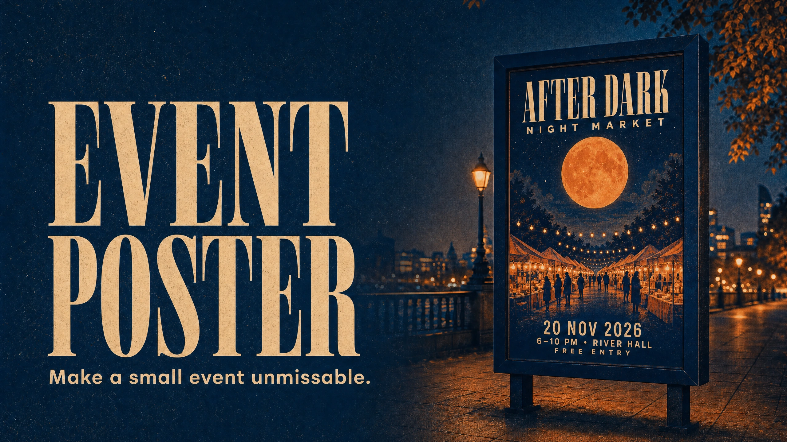
An enormous orange moon rises above a row of market stalls in this charming image. Above the stalls in the image the two words ‘AFTER DARK’ rise up to fill the page in large bold letters. It is immediately obvious what the artist wants you to feel, then you read the lower part of the image and find out the details of the fictional event such as the date and time it is due to take place, where it is taking place and how to get in.
An event poster was created for a tutorial, a night market which does not have any tickets for sale and is not an actual event. It uses an attractive AI illustration for the poster and have added details which a small business could use after approval.
The most important words should be the first that someone reading the poster needs to act on. The date and location of an event are the most important words for an event poster and must be clearly obvious and not afterthoughts.
Give the poster one useful promise
The name of this concept is “AFTER DARK” and the description of this event is “NIGHT MARKET.” Therefore in this event we walk around in the evening time between stalls which are lit up and do business from 6–10 PM.
Note the huge moon has been deliberately exaggerated to make a point. The crowd, buildings etc. in this image are all illustrative and not to be used as ‘reference’ of a real venue or experience that you are advertising. Also do not mislead with an ‘invented’ crowd etc.
You don’t need to come up with multiple different concepts to make a poster look creative. The image should represent the event. An evening market such as this sets up light against darkness. A plant swap held in the day could include the leaves of plants, pots and a much milder color palette than this. Brief out the connection in simple language.
For the night market the information to include on the poster is quite simple: 20 November 2026, 6–10 PM, River Hall, free entry. These are fictional details for the tutorial. In reality you would use the organizer’s approved information including the correct address and working booking URL where necessary and confirm in a handoff meeting that you have correctly transferred the letters to create the event poster.
Keep the approved copy with the generated poster for comparison purposes. It is a lot easier to notice that the model changed the “20” to “28” when you have the approved text right next to the generated text.
Build the illustration around the words
This handoff was created using PromptWise with the image generated by GPT Image 2.0 for AI Video Bootcamp. PromptWise is affiliated with AI Video Bootcamp. The illustrations leave two dark areas, above the moon and below the stalls, to use for the words ‘AFTER DARK’ and ‘NIGHT MARKET’ event details. Note the dark areas of the top and bottom of the image are to be used for lettering and that the base artwork would include a lot of blank space which is to be used.
Here is a starting prompt for the picture alone:
“Portrait illustration for a fictional night market. A huge warm orange moon above lantern-lit market stalls, deep indigo sky, orange striped canopies and small silhouettes walking between the stalls. Rich printed-paper texture and bold shapes. Keep the top and bottom areas dark and quiet for later lettering. No text or logos.”
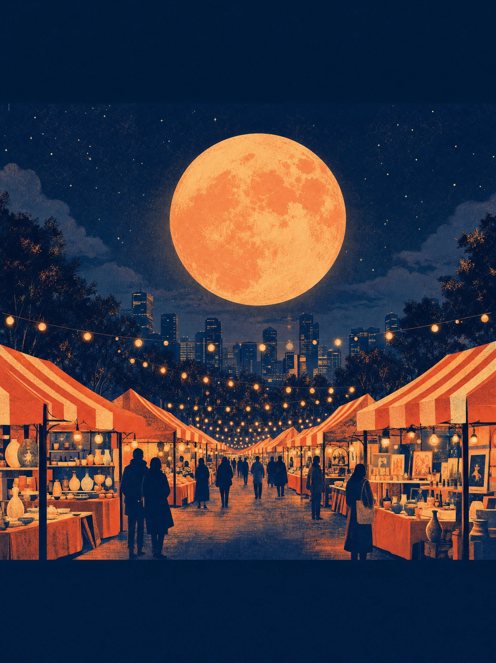
The artwork-only starting image. The city skyline was already present in this generated illustration.
The prompt not only described the illustration, but also reserved areas for the title and the details for the event. As a result, the illustration has a lot of open space above the large, warm orange moon and below the stalls. This space has to be used for the title and the details for the event.
This completed poster reference was created using the illustration provided as a reference to create the finished Event Poster. Note that the completed Event Poster has had some of the market stalls and crowd re-interpreted whilst maintaining the full illustration quality. However, as this is a Fictitious Scene, it should be perfectly workable to utilize this completed example. In contrast, if you were to utilize an Approved Image (i.e. Approved Illustration or even better – a Real Venue Photo), you would then add the text to this in your preferred Layout Editor instead.
For the visual elements of your poster, we recommend you look at the tutorial on learning to use AI image generation from AI Video Bootcamp and their cheat sheet for AI image prompts.
Let the title lead and the details finish the job.
The title of the poster is ‘AFTER DARK’ (in large type) followed by ‘NIGHT MARKET’ (in smaller but still widely spaced type). The details for the event follow in the bottom navy band: ‘20 NOV 2026’ is followed by ‘6–10 PM • RIVER HALL’ and then ‘FREE ENTRY’.
First, information of different importance has to be displayed in different sizes. Then, information of similar importance should be grouped together. In this case, the information about time and place is of similar importance and thus has to be displayed together as well. This information answers the question of who goes where when, thus it has to be easily accessible for the reader.
It’s also worth noting that all the lines shouldn’t be of roughly equal size. The main title would be the largest followed by the rest in decreasing order of size with the supporting information being easiest to read.
Poster designer Grzegorz Domaradzki, known as Gabz, was quoted in a February 2018 Adobe Blog article on poster typography: “typography usually comes last, and it’s both a great joy and a challenge for me to find a perfectly matching type.”
This is, of course, a useful distinction to understand when designing your own posters for your events, and is relevant when planning room for lettering in an AI image. How you design the final lettering for your AI image can be different to how you design the words for a poster for your event.
The five lines of copy – ‘AFTER DARK’, ‘NIGHT MARKET’, ‘20 NOV 2026’, ‘6–10 PM • RIVER HALL’ and ‘FREE ENTRY’ – formed the five ‘information groups’ of the poster, and so there are six information elements because time and venue share one line. The finished poster is shown below.
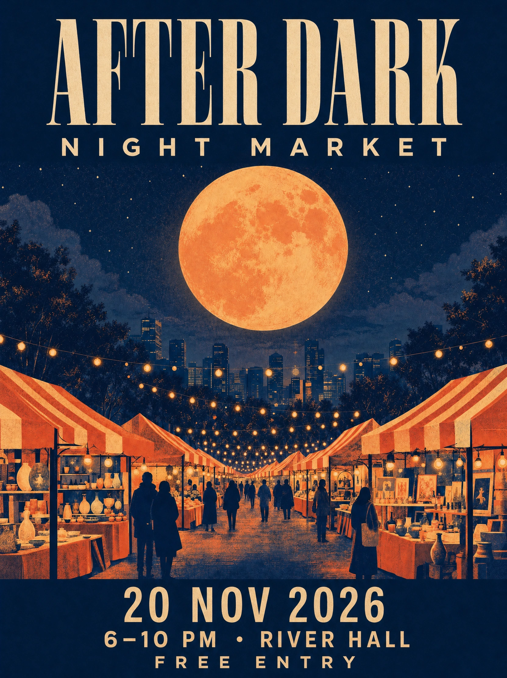
The completed fictional event concept. All five copy lines were inspected at full size and at about 320 pixels wide. This is a design preview, not a print-ready file.
“Create the finished event poster from this accepted illustration. Preserve its warm orange oversized moon, ink-blue starry sky, market stalls and all illustration quality. Fill the empty top navy band with bold elegant condensed cream title on one line ‘AFTER DARK’, and below that smaller but very readable widely spaced ‘NIGHT MARKET’. Exact bottom navy-band copy: ‘20 NOV 2026’ then ‘6–10 PM • RIVER HALL’ then ‘FREE ENTRY’. Make all six information elements unambiguously readable, correct spelling, even kerning, no gibberish. Keep generous outside safe margins. One complete polished cultural-event poster, sophisticated designer typography, not a mockup in a frame. This event and venue are fictional practice copy. No added other text, no sponsors, no URLs, no QR, no watermarks.”
Go back through your brief one line at a time and read against the completed copy for the title and details of the poster. Pay as much attention to the punctuation and the year as you did to the large title.
Check the version people will actually see
There are 6 pieces of information for 5 lines of copy. Time and Venue share a single line but are two pieces of information. The artist’s use of the base illustration to create the scene includes a city skyline in the background. It would be advisable to check these ‘additional’ elements for a real event and ensure they do not give a wrong impression of the location of the real event.
This finished poster has been viewed at full size as well as shrunk down to about 320 pixels wide to test the readability of the finished design. The name of the event is large and dominates the rest of the information, which is then read in a compact block below the image.
It is worth checking how your poster looks on a phone screen. Even if all the information on your poster is readable on your phone, the details may not be visible enough from across a room.
Also, examine the graphical artwork for signs, labels and even background smudges that could be misinterpreted as part of the text. Try to remove or simplify them so that they do not draw attention to themselves and are not incorporated into the final design.
For a digital poster, the contrast ratio for ordinary text according to the WCAG rules would need to be 4.5:1 or higher, while qualifying large text would require a ratio of 3:1 or higher, subject to the standard’s definitions and exceptions. Note that a bright color scheme does not automatically meet these requirements. It is also wise to include the main details of your event in the post or page text in an accessible manner.
Photorealistic AI prompts are used to create event posters that have a ‘photographic’ style as opposed to illustrations. The written information should always be able to be read more easily than the interesting graphics within the background of a poster.
Know when a concept still needs print work
The generated image for the completed night-market event-poster is 1664x2224 pixels. This completed image is used as a preview of the completed design-work. Note that this image alone is not sufficient to be sent off to all sizes of printers, i.e. for all print-sizes.
An 18-by-24-inch poster at 300 pixels per inch would require a 5400 by 7200 pixel image, before bleed (an illustrative calculation). The generated image can look large enough on screen, yet require further preparation for printing at specific sizes and on various printers at different viewing distances.
Bleed – additional art required to prevent margins from appearing white. Typically 0.125 inches (about 3mm) beyond the trim edge, but can vary by print provider. This means that all critical typography should be contained within the safe area for the printer’s specified dimensions. Do not stretch a title into the bleed to fill a border.
To ensure the print comes out right, ask for the size in inches, the exact colors to use, and what file type to save it as. Try to keep the copy (the ‘text’) you created in editable form and as a separate file from the artwork itself. This way, changes to the venue or date will not force you to re-create the entire poster. Make a hardcopy ‘proof’ before declaring the job complete.
The above exercise was useful in creating a visual concept for an event and checking the details for readability. The next step for an actual organizer would be to approve the copy and prepare the file for the actual placement (print or online). In this case, however, no print poster was created and no claims were made about the event selling tickets.
Now describe another event. Just describe it in a sentence. Then create an image that uses the words as a reason for the image to exist. See if you can get the image to be so compelling that the information in the image for the event makes sense, if someone still has to ask for the date, that is the next thing to fix.
Sources and visual credits
Adobe Express — Poster layout and design
Adobe Blog, 27 February 2018 — Poster typography and Gabz quotation
All illustrations were generated for this article through PromptWise using GPT Image 2.0. The event, date, venue and entry details are fictional. No physical print or attendance test was conducted.