
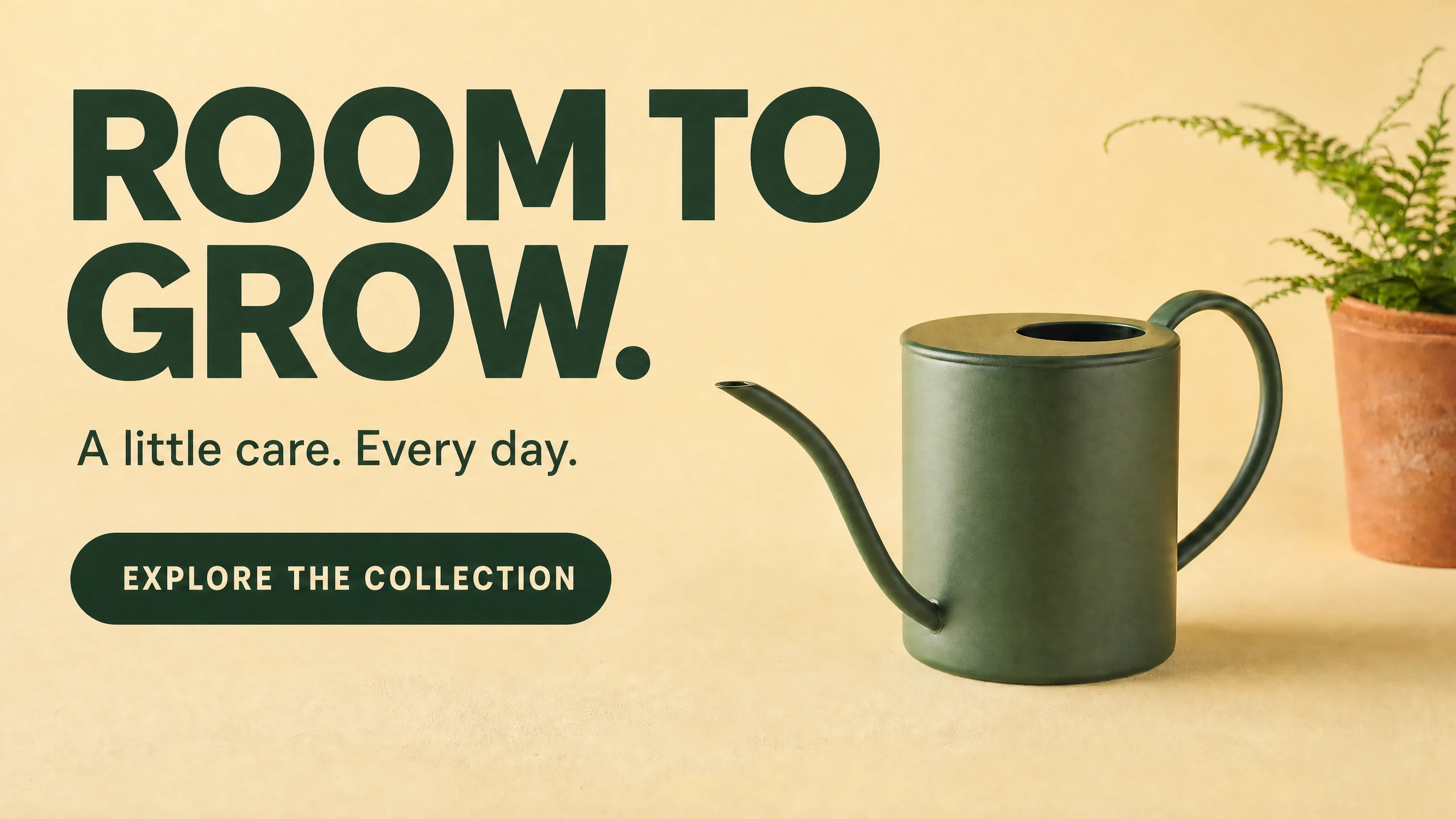
The finished landscape concept: a bold message occupies the quiet area beside the watering can. Fictional campaign generated with GPT Image 2.0 through PromptWise.
Write your headline first, and then try to figure out where that headline will go. If your headline is too long for the space beside the beautiful product image that you have just generated, then you may need another product image (with more room beside the product). That could be quite a beautiful image too.
The “ROOM TO GROW.” message belongs on the left of the product image and the product itself is a green watering can with a fern in a terracotta pot in the background. The broad yellow area of the background on the left of the watering can is the negative space reserved for the message. The wording on the left of the image belongs in that negative space beside the product image on the right.
This example was created with GPT Image 2.0 via PromptWise, built by the AI Video Bootcamp team. AI Video Bootcamp benefits financially from PromptWise subscriptions. This is a completely fictional campaign for a gardening shop. Just for demonstration of a good composition for ads with a headline. Not a real product launch or evidence of increased sales. Just for illustration.
The space has a job
The negative space of an image is the space around the subject or positive space of the image. For the example above the broad yellow area of the background is the negative space to the positive space of the watering can.
Nikon School suggests the negative space in a photograph can actually contain color, texture and even dimension. So a softly lit wall could work well as background negative space for your image, or even a calm patch of sky. But the key question is whether it is supporting the subject or continuously interrupting it?
A background empty of objects of interest is not necessarily quiet enough for text in an ad. A strong shadow from a background such as a wall can even cut across a headline.
One has to judge the finished layout though and consider the space required by the headline for the letters themselves and some breathing space around them. And of course one also has to consider the product in the ad.
Give the words a place before you prompt
First, write the words you will use for the headline and supporting copy for the product image. In this case, the headline is “ROOM TO GROW.” It covers two lines nicely. Supporting copy for the image would read “A little care. Every day.” The call to action for the advertisement would be “EXPLORE THE COLLECTION”. Note that these are fictional campaign lines for a fictional gardening campaign and not actual copy for an existing retail store.
The supporting line for this ad is “A little care. Every day.” The call to action for this ad is “EXPLORE THE COLLECTION” – again, a totally fictional campaign line, and completely unrelated to any real shop or offer. My message is to introduce a gardening collection of some sort, and then invite the reader to EXPLORE THE COLLECTION in more detail.
It is worth noting that Nikon School states, as a rule of thumb, there should be about twice as much negative space as there is in the subject(s) in your image. However, there are many exceptions to this rule – the length of the can’s spout or handle, the width of the can’s body, or even the natural break in a long line of text all can affect the required amount of negative space to achieve your goal.
To add a headline to the left of our gardening product I would begin by roughly drawing two areas on a piece of paper - the headline on the left and the product on the right. You then need to sketch out the silhouette of the product on the right hand side of your drawing, taking care to note how far the long spout reaches towards the words on the left. You then need to make sure that the headline ends before it collides with the product’s silhouette.
Generate a base you can work with
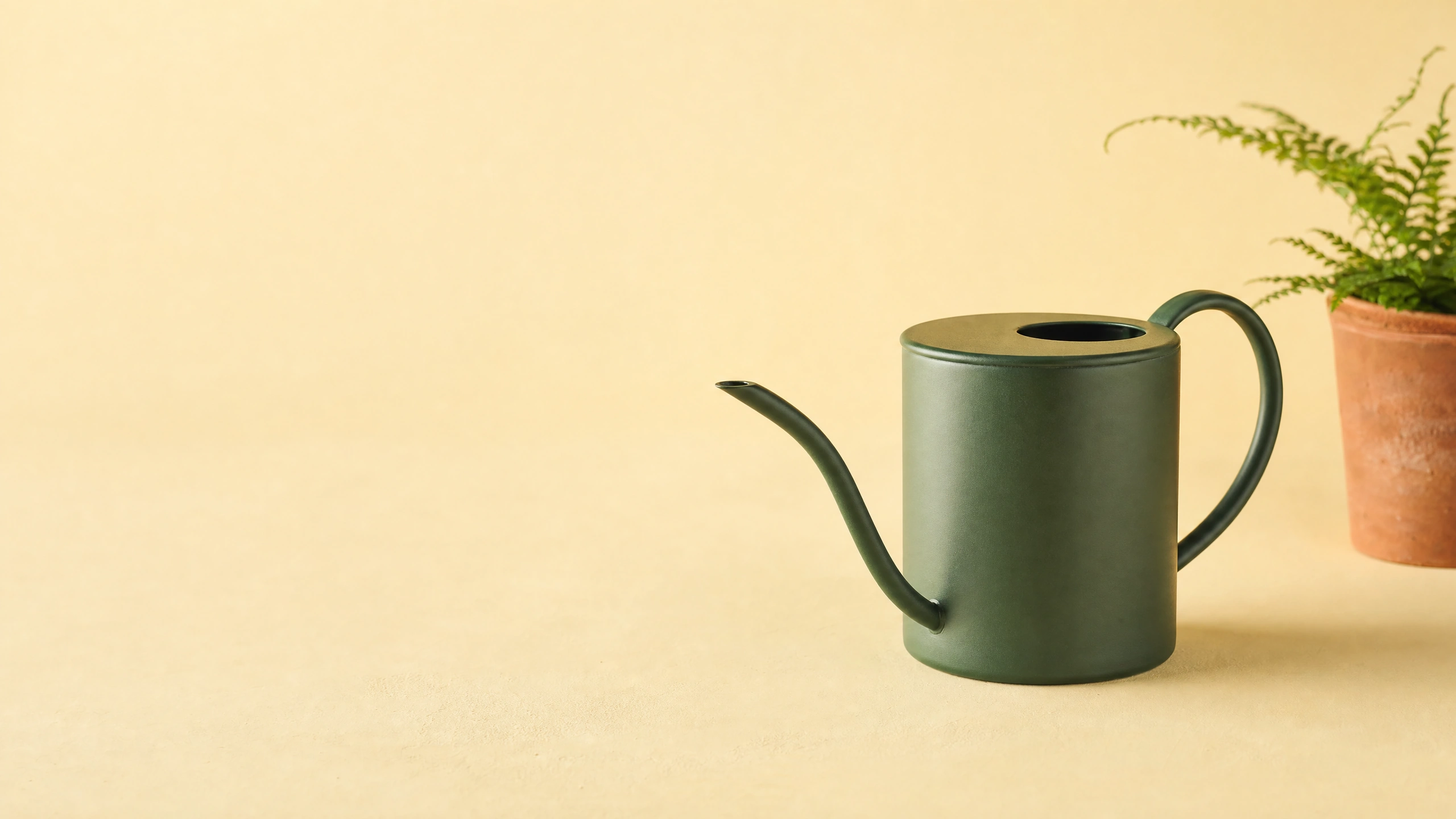
The text-free starting image leaves the left side open. Keep this clean base as well as the finished layout. AI-generated illustration, GPT Image 2.0 through PromptWise.
The clean base image for this article was created as a 16:9 landscape image (size: 2k, high-quality). GPT Image 2.0 in PromptWise was used to generate the image. It’s 2560 pixels x 1440 pixels in size. The settings chosen for this example are by no means necessary for creating negative space images.
There is an important point of direction regarding the composition. The scene is set as a landscape image with a matte green metal watering can of approximately medium size situated on the right-hand side of the scene. Behind the watering can is a small fern in a terracotta pot. The background of the scene is to be a warm, pale yellow in color. There is to be soft light entering from the upper left hand corner of the scene in order to give some definition to the metal of the watering can.
Here is a shortened adaptation of the direction used for the base:
“Create a landscape product image of a Matte Green metal watering can on the right side of the image with a small fern in a terracotta pot sitting behind it at the far right of the can. Background of the image should be a warm, pale yellow color. There should be a large amount of negative space on the left side of the image to place the headline. Soft, upper left lighting. Product should be easily seen and left background should be props free with no strong shadow edges. Do not add lettering.”
All of the directions in the above write-up for the generating of the image told the model what to show. The prompt specified the position of the product, the background, and even the lighting. The guidance for generating negative-space images from Google follows a similar approach: state where the subject of the image is to be, state what the background is to be, and state where the lighting in the scene is to come from. The model may or may not actually follow the guidance, but it is necessary to state it.
Remember when generating images of products that you must use an image that you have permission to use for the product reference. Also, make sure that the generated image matches the real product (handle, rim, spout and surface finish). Learn more about how to generate images with AI in this helpful guide on how to learn to control AI image generation from AI Video Bootcamp.
Add the headline, then check the product again
The clean image for this article was then used as a reference for a second generation of the image, by uploading it in an image-reference or image-editing mode within your chosen tool (as opposed to simply pasting the words into a text-only generator). The edit request specified that three exact lines of text be added (the ‘supporting line’ of text below the headline, and the button-shaped ‘call to action’ at the bottom), all to be created using dark green typography in the open area of the negative-space composition.
The words in the finished image example are all correctly spelled and the headline is kept well away from the spout of the watering can. The watering can, fern and yellow setting all look recognisable enough but the colour and surface texture of the can have been altered to make it look more mottled.
You can adapt this instruction to your own base:
“Use this reference image and maintain the composition of the product, background and lighting. For the headline on the left add the text “ROOM TO GROW.” on two lines. Then add “A little care. Every day.” and “EXPLORE THE COLLECTION” on the following lines. Use clear dark-green colored text and allow for plenty of white space between the text and the product. Do not add any further text.”
The generation of the lettering is suitable for exploring the concept. For the production, however, I would add the text as editable text, in case a slight change in the offer or in the translation is required later. The clean base is still worth keeping even after the successful creation of the ad.
If your generated images are crowded then change the framing specified for the generation step before adding too many fancy adjectives to the basic description. It could be as simple as changing “move the product to the right” to “move the product farther to the right”. That simple change may open up the composition sufficiently.
Photographer Eric Stoner wrote in a 2015 Canon article: “Sometimes making a great photograph means choosing a slightly different camera position or lens choice.” He was discussing photography.
Refer to the cheat sheet on the AI Image Prompting page for AI Video Bootcamp. Start with the one change that would have the biggest impact. Move the product farther right. Softer background shadows. More room above the supporting line.
Test the small version
Similarly, check that your headline and supporting line(s) of text are readable at the size that they will be viewed at (i.e. online, as opposed to in a printed out image). Check that all of the words and punctuation are correct, and that from the image alone it is clear what product you are selling.
Looking at the entire background, we can see that a dark word on a pale yellow background may read well over the background color, but be unreadable where it crosses a dark area of the foliage (e.g. the stem of a leaf). Re-positioning the words to a clear area of the background may often be more effective than adding a word outline or shadow.
W3C documents WCAG contrast ratio for text in Web pages, setting a minimum for normal text at 4.5:1, qualifying large text at 3:1 and noting certain exceptions. For large text, it states that 18pt or greater, 14pt or greater bold, or equivalent qualifies as large text. As before, the existence of this content does not make the entire image accessible. Check the actual color used for the background vs. text in the final composition.
Test in portrait orientation as the lines may overlay the can, recompose in this orientation and re-arrange the message to fit within the new space of the image. The new composition does not have to look similar to the original, but keep the same message and product identity.
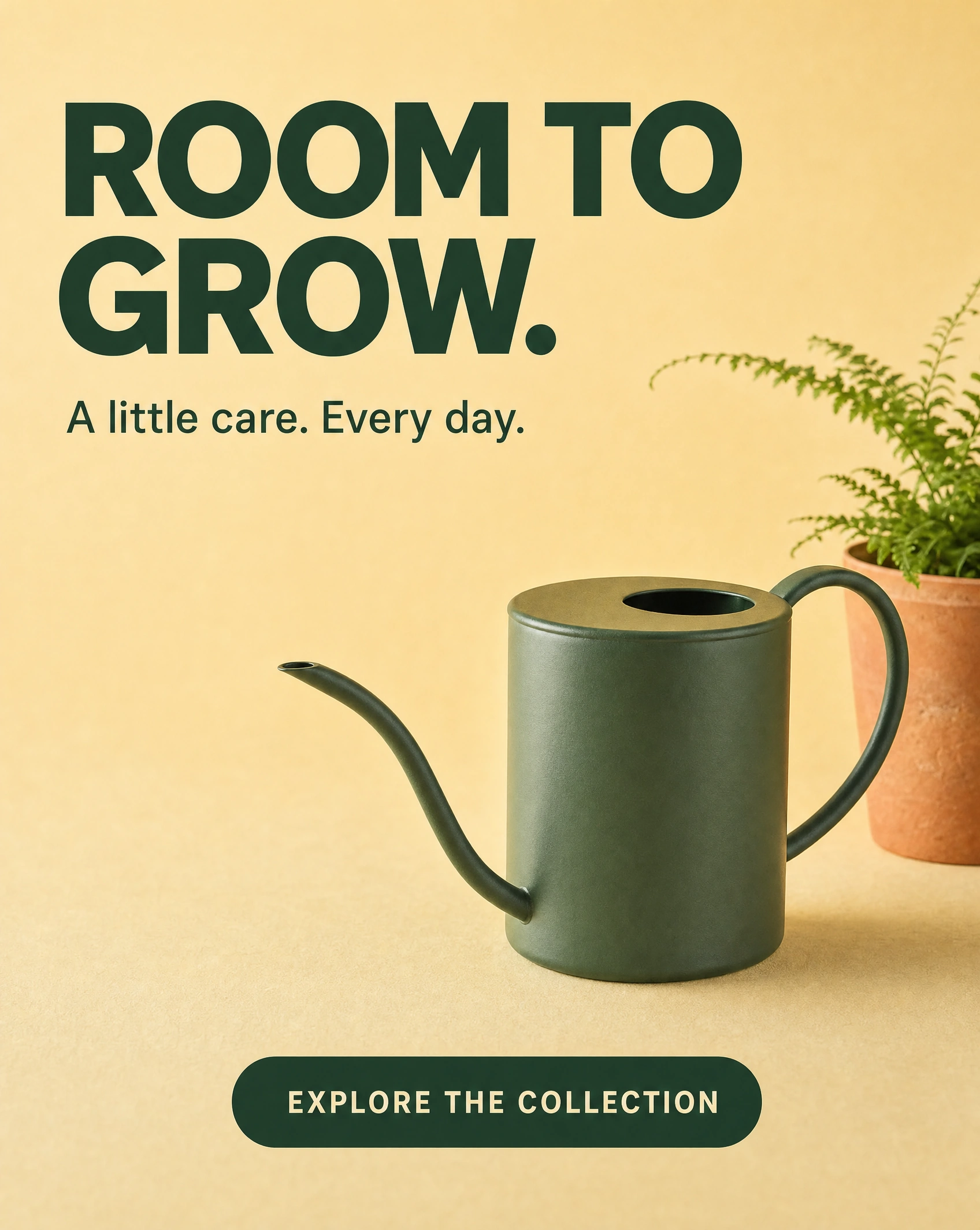
A separate portrait arrangement gives the message and product new positions. This is a fictional AI-generated concept, not a crop or proof of exact product preservation. GPT Image 2.0 through PromptWise.
Keep the picture and the message usable
For a website hero, make sure the headline is used as real page text and use a real link or button for the action. The pill in this example is only a visual representation of a call to action, not a functioning button. See W3C’s images-of-text for more on this and why using real text is better than generated letters for an image that will be used as a hero on a website.
When testing the output of a service, inspect the final exported image as well as the working layout and editor view. Keep a text-free image and a fully editable version of the layout that you can revert to and start to make changes to when the wording or placement of the ad changes.
For your next generating exercise, start by showing a potential client one complete and coherent way of using the generated product image, ie the image + the finished layout it was designed to support. The image of an empty background is often a blank that the client has to imagine. A readable example of a finished ad allows the client to see that you actually have an idea that can be put into practice with the generated image.
For a next test, simply pick a product and a short headline for it. Position them in the space before generating the image. When the image has been generated add the words to the image. You can then assess whether the words are readable or not. If not then you will need to re-configure the composition to add more space to allow the words to be read clearly whilst the product still is of interest.
Sources and visual credits
Nikon School: negative-space composition
Eric Stoner: Tips for Better In-Camera Composition, Canon, 2015
Google: image-generation guidance
All campaign illustrations were generated for this article using GPT Image 2.0 through PromptWise. The product and campaign are fictional. No stock photograph was used. Generated lettering is part of the illustration, not a live website control.