
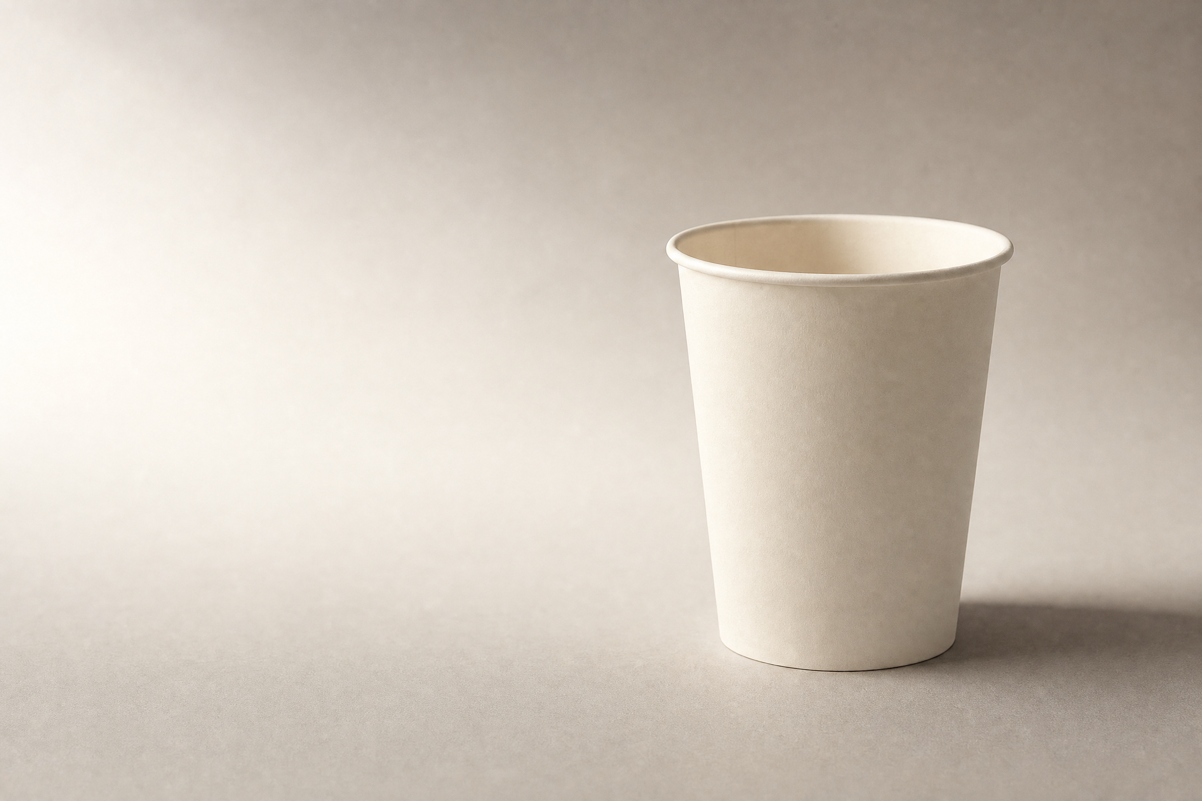
Give a plain paper cup a campaign built around a quiet morning break. Start with the product you actually have, use soft side light to show its shape, and leave room for a short headline. Let the setting carry the mood without changing what the cup looks like.
The idea is “Take a minute”: a fictional coffee-counter campaign with a main image, a close-up and a scene with a closed notebook. The illustrations show that direction using a generated cup. For a real product assignment, begin with photographs of the cup you need to represent.
Start with the pause
Choose the feeling before you choose the background. For this campaign, a quiet morning pause gives you a reason to use warm gray, cream, soft light and a little empty space. Those choices should guide the whole set, even as you change the framing from one image to the next.
“Make it luxurious” leaves a lot open to interpretation. A marble pedestal, a gold surface and a dramatic spotlight could all fit that request, yet take the cup in quite different directions.
Write a brief you can actually use:
A neighborhood coffee counter. Warm gray and cream, with a dark-brown accent. A matte tabletop and soft light from the left. One plain paper cup, plenty of breathing room, and the line “Take a minute.”
Now you have something to judge against. A closed notebook can suggest work put aside. A busy table full of props would need a stronger reason to belong.
Simple does not automatically mean luxurious. A 2018 study by Jung Eun Lee, Songyee Hur and Brandi Watkins reported two experiments in which familiarity with a classical luxury fashion brand changed how people responded to visual complexity. Familiar brands benefited from simpler images; unfamiliar brands showed the opposite pattern. That finding does not tell you how coffee customers will respond.
Keep the restrained style because it suits the pause you want to suggest. You can choose a different visual language for a different brief.
Get the cup right before you improve the scene
Take clear reference photos before asking AI to change the setting. You need to see the cup’s shape, rim, base and surface well enough to compare them with the finished image. Photograph any extra angle you plan to show, rather than leaving the generator to invent the hidden side.
A phone, a stable table and a neutral background are a reasonable starting point. Shopify’s product-photography guide describes a simple window-based setup and includes smartphones among the camera options.
Take the main view, then move in for the rim. If you want a lower camera angle in the finished campaign, capture that view too. A front photograph cannot tell you what an unseen seam looks like.
Keep the originals untouched. Note the details that identify your cup: how strongly it tapers, how thick the rolled edge is, where a visible seam sits, and whether the paper is smooth or textured.
Clean off loose dust before taking the reference photos. After that, resist the temptation to improve the material itself. A smooth cup does not need invented fibers. A delicate paper rim should not become a thick, glossy ceramic edge.
If you are still learning to judge these changes, AI Video Bootcamp’s guide to learning AI image generation offers a broader practice path.
Let the shadow do some work
Use the light to describe the cup’s rounded shape while keeping its paper surface visible. For this quiet morning direction, start with soft light from the left and a gentle shadow to the right. Check the base carefully: it should appear to rest on the tabletop, with no unexplained gap.
Profoto’s softbox guidance explains the useful relationship: a larger light source relative to the subject produces softer light. That does not mean the largest available light is always the right choice.
Look at what the light is doing to your cup. If the shadow side loses too much detail, try a white card to return some light. If everything looks flat, reduce that fill. Shopify also describes using black board to deepen shadows.
Brightness and detail need separate attention. In Broncolor’s white-on-white perfume-bottle example, the background measures RGB 254/254/254, while separate lighting defines the object. You do not need to copy that value for a paper cup. The useful lesson is to control the background without washing away the product’s edges.
Before adding anything else, look where the base meets the table. A floating edge or an unrelated shadow can make an otherwise attractive image feel wrong.
Give each picture something to say
Build the set around three different jobs: introduce the campaign, show the material, and suggest a moment of use. Keep the cup, palette and light consistent while changing what the viewer notices. Each image should add something; three slightly different versions of the same wide view give you less to work with.
The main image is the invitation. Put the full cup to the right and leave clear space on the left for “Take a minute.” Add the words as separate, editable type so you can adjust them without regenerating the picture.
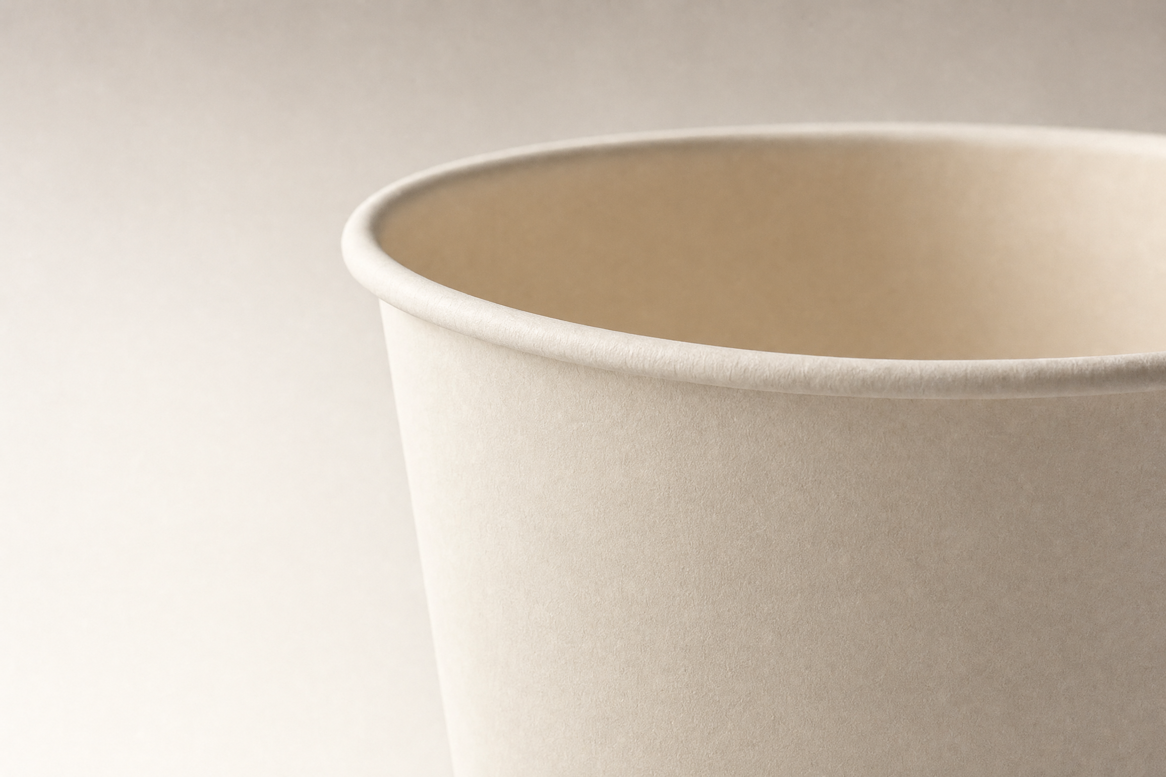
For the close-up, concentrate on the rim and adjoining paper. Match the direction of the light to the main image. You want a closer look at the same object, including the details in your reference.
The contextual image can be just as simple. Let a closed notebook enter at the edge of the frame, behind the cup. It gives the pause a little context without requiring a person, a pen and an entire office scene.
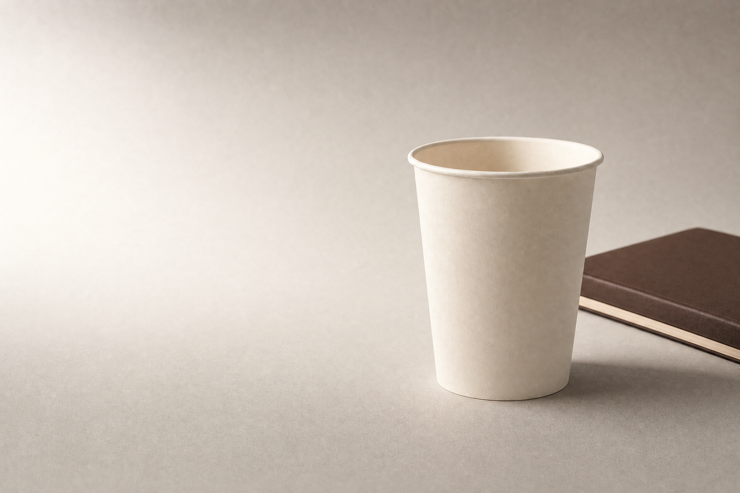
Product and food photographer Sarah Aagesen puts it neatly in Adobe’s product-photography guide: “the product is the star.” If your eye goes to the notebook first, make it smaller in the frame or move it farther out.
Keep the three pictures beside one another as you work. A lovely close-up with completely different light can still feel out of place in the campaign.
Decide what AI is allowed to change
Choose how much control you need over the product before editing. Keeping the photographed cup on its own layer lets you build a new setting around it. Editing the whole reference gives you more room to explore, but it also means checking whether the generator has changed the cup itself.
For the separate-layer route, generate an empty setting and place your cup photograph above it in a layer-based editor. Adobe’s layer-mask instructions explain how to reveal a selected part of a photograph while hiding the surrounding area.
Spend time on the rim and base when refining the mask. A clean cutout still needs a background with compatible perspective and lighting. A mask cannot fix those relationships for you.
Try this as a starting prompt for the empty setting:
Create an empty warm-gray matte tabletop with a softly receding background. Match the viewpoint and light direction of the attached reference photograph. Diffuse light comes from the left. Leave the right-center area clear for a cup to be added afterward, and keep the left side quiet for a short headline. No objects, cup, lettering or logos.
Compare the returned setting with your photograph before combining them. If the table is seen from too high an angle, fix the setting before spending time on the cup’s edge.
Compositing is an established photographic approach. In the same Adobe guide, professional photographer Jason Deymonaz describes combining 3-10 captures into one image. That is his working practice, not a target number of generations for this project.
If you choose to edit the whole reference with Nano Banana Pro, Google’s prompting guide recommends defining what each reference contributes. Let one image establish the actual product and another, if needed, guide the lighting or palette.
Ask for the visible rim, taper and paper finish to remain consistent. Then compare the output with the product photo. Google’s guide acknowledges fine-detail errors and artifacts in complex edits; a preservation instruction is still a request you need to check.
For help organizing those instructions, use the AI image prompt cheat sheet. If the cup keeps changing, return to the photographed product layer.
Make it work where people will see it
Check the intended layout before you commit to the composition. A picture with plenty of space in a square can become cramped in a wide banner. Keep the cup in proportion, leave room for the headline, and inspect every crop at the size people will actually see.
Here is a crop calculation using a hypothetical 2,400 x 2,400 pixel square image, with no padding, expansion or resampling. It is separate from the landscape illustrations in this article.
Layout | Crop dimensions | Original area retained | Area removed
Square, 1:1 | 2,400 x 2,400 px | 100% | 0%
Portrait, 4:5 | 1,920 x 2,400 px | 80% | 20%
Wide, 16:9 | 2,400 x 1,350 px | 56.25% | 43.75%
Tall, 9:16 | 1,350 x 2,400 px | 56.25% | 43.75%
The retained percentage is the crop’s pixel area divided by the square’s 5,760,000 pixels, multiplied by 100. Keeping just over half the original area can leave surprisingly little room for both cup and headline.
Move the crop around and judge it. If it cuts off the rim or crowds the words, prepare a composition for that shape. Stretching the cup to fill the space changes its proportions.
Keep “Take a minute” separate from the image until you have settled the layout. Check that the words remain readable and do not obscure the product. The line describes a mood; it does not promise insulation, sustainability or another unverified product feature.
Check the cup before calling it finished
Compare each finished image with the relevant product photograph, then look at the campaign as a set. Check the rim, taper, base and paper finish before judging the overall mood. Finally, inspect the headline and crop at delivery size so a good-looking preview does not hide a practical problem.
Make corrections specific. “The cup looks too glossy” identifies a surface problem. “The notebook draws attention away from the cup” suggests reducing its size or moving it toward the edge. “Make it more premium” leaves the next step unclear.
Save the approved images with your original photographs and editable files. Keep a clean product image for any listing that needs one, and check the destination’s requirements separately from the campaign design. AI Video Bootcamp’s guide to AI product-photography services covers the wider service context.
If one picture still feels wrong, return to the main image and compare the choices that already work: the same cup, the same light, the same quiet space. Change the part that breaks that agreement.